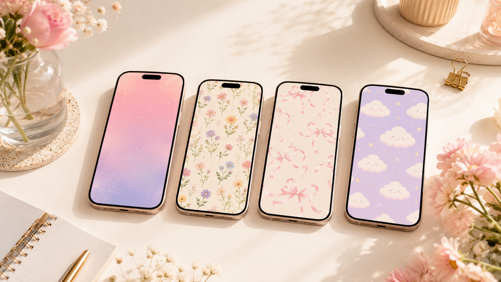
17 Cute Wallpaper Ideas to Match Your Phone’s Aesthetic
Your phone is one of the things you look at most throughout the day, so the wallpaper should feel like a small reflection of your personal style. A cute wallpaper can make your iPhone feel more organized, more cheerful, and more intentionally designed without changing the case, icons, or apps.
The best cute wallpaper ideas do more than look pretty in a saved image. They also work behind the clock, widgets, notifications, and app icons. That means choosing a design with enough open space, readable contrast, and colors that fit the overall mood you want for your screen.
Whether your style is soft and feminine, playful and colorful, cozy and neutral, or simple with one charming detail, the ideas below can help you create a lock screen and home screen combination that feels polished and easy to use.
How to Choose a Cute Wallpaper That Works on an iPhone
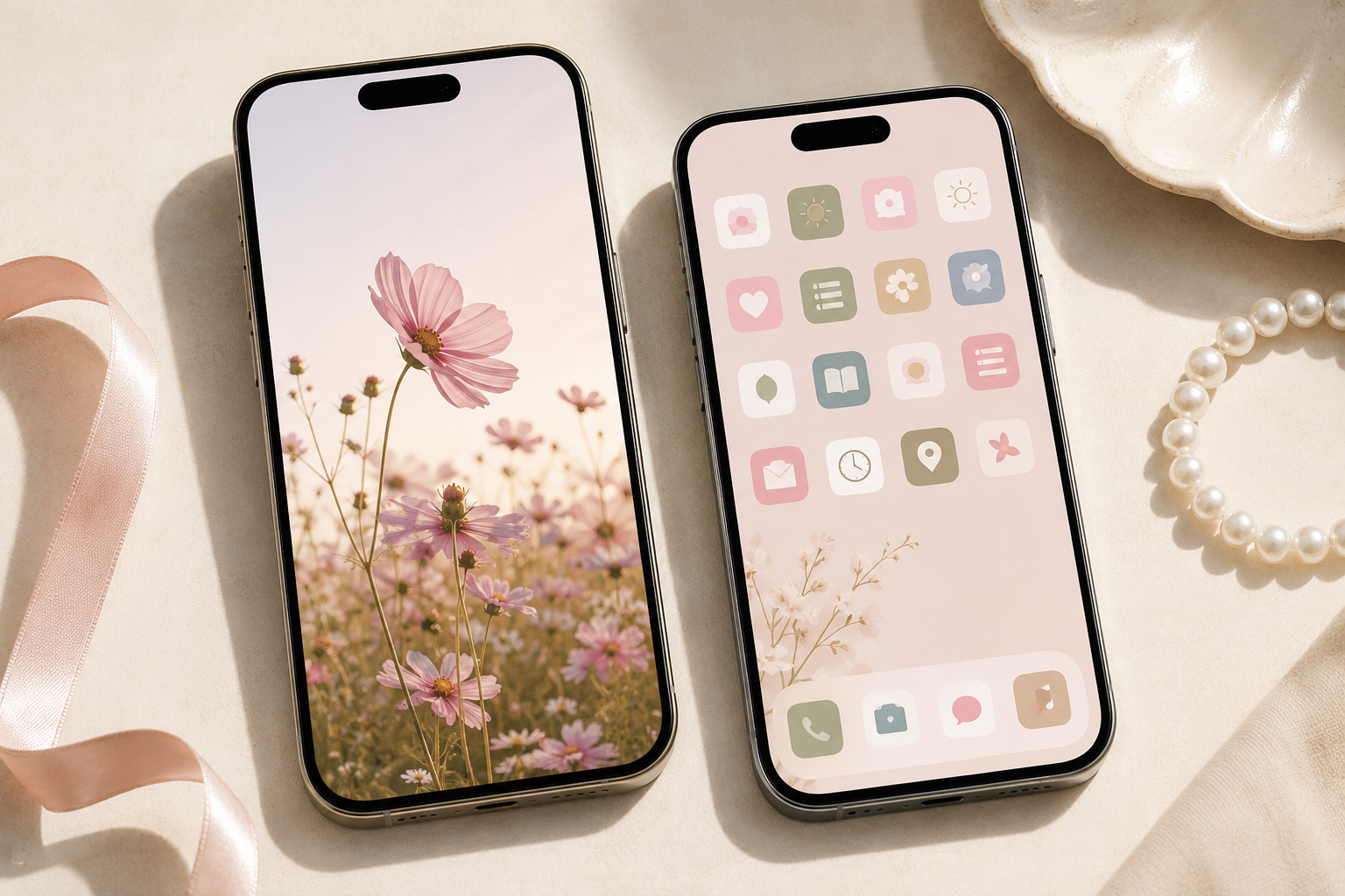
Before choosing a design, decide whether the wallpaper will be used on the lock screen, the home screen, or both. A detailed image often looks best on the lock screen, where there are fewer icons. A simpler pattern or softly blurred version usually works better behind apps.
- Leave space for the clock: Choose a lock screen image with a calm upper section so the time remains easy to read.
- Check icon visibility: Avoid busy patterns that make app names and icons disappear into the background.
- Use a consistent palette: Pick two to four main colors that coordinate with your case, widgets, and favorite app icons.
- Test light and dark areas: A wallpaper may look different once notifications, widgets, and interface elements appear over it.
- Choose the correct crop: Save a vertical image with enough extra space around the main subject so it can be repositioned without cutting off important details.
A coordinated pair is often the easiest solution: use the more decorative version on the lock screen and a cleaner matching background on the home screen.
1. Soft Pastel Gradient Wallpaper
A pastel gradient is one of the easiest ways to give your phone a cute, calming look. Try blended shades such as blush pink and lavender, peach and butter yellow, or mint and pale blue. The gradual color change adds visual interest without competing with icons.
For a more polished result, choose a gradient with a lighter center or upper section. This keeps the clock and widgets readable. A subtle grain texture can also make the design feel less flat while preserving the clean aesthetic.
2. Tiny Wildflower Pattern
Small scattered flowers create a sweet wallpaper that feels timeless rather than overly themed. Look for delicate daisies, forget-me-nots, tulips, or mixed meadow flowers on a cream, pale pink, soft blue, or light sage background.
This style works especially well when the flowers are evenly spaced and not too detailed. Use the full floral pattern on the lock screen, then pair it with a solid background pulled from one of the flower colors for the home screen.
3. Coquette Bows and Ribbons
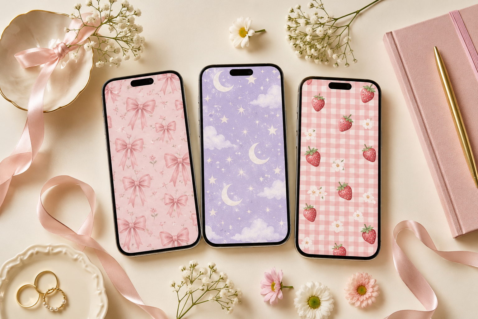
Bows are a natural choice for a soft, feminine phone aesthetic. A repeating ribbon pattern, one oversized satin bow, or a few delicate line-art bows can create a cute coquette-inspired screen without feeling cluttered.
Try ivory bows on dusty rose, black ribbons on a pale cream background, or powder blue bows with tiny pearl details. Keep the design balanced by placing the largest bow below the clock area or near the lower half of the screen.
4. Smiling Clouds and Stars
For a playful look, choose a sky-inspired wallpaper with rounded clouds, tiny stars, crescent moons, and subtle smiling faces. This style can feel cheerful and nostalgic while still looking clean when the color palette is limited.
Pastel blue, lavender, pale yellow, and white work well together. A design with open sky near the top is ideal for the lock screen, while a smaller repeating cloud pattern can make a practical matching home screen.
5. Strawberry and Cherry Prints
Fruit patterns make a phone background feel bright, youthful, and perfect for spring or summer. Strawberries on gingham, cherries on cream, or tiny raspberries on pale pink can add color without requiring a complicated layout.
Choose illustrations with simple shapes and generous spacing. Red fruit can be visually strong, so balance it with a lighter background. For a coordinated setup, use the fruit print on the lock screen and a muted pink or cream background behind app icons.
6. Pink Gingham or Picnic Check
Gingham brings a cozy, vintage-inspired feel to an iPhone screen. Soft pink and white is the classic cute option, but lavender, peach, butter yellow, and sage checks can feel equally charming.
Smaller checks usually work better behind icons, while a larger picnic-style pattern can look striking on the lock screen. You can also add one small central motif, such as a heart, bow, flower, or cherry, to personalize the design.
7. Minimal Heart Wallpaper
A heart wallpaper does not need to be bright red or covered in symbols. One tiny heart centered near the bottom, a loose pattern of hand-drawn hearts, or a simple outline heart on a neutral background can feel cute and understated.
Try soft combinations such as burgundy on blush, white on dusty blue, or black on warm beige. This is a strong option for anyone who wants a romantic detail while keeping the screen simple and easy to read.
8. Cute Animal Illustrations
Small animal illustrations can make your phone feel personal and comforting. Popular options include sleepy cats, floppy-eared rabbits, tiny bears, ducks, puppies, frogs, and woodland animals.
For a refined look, choose one illustration style and a limited palette rather than a crowded cartoon scene. A single character peeking from the bottom edge can be especially effective because it leaves the upper screen clear for the clock and notifications.
9. Retro Flower Power Background
Rounded retro flowers bring energy to a cute phone setup. Choose a 1960s- or 1970s-inspired pattern with simple petals, bold centers, and warm colors such as orange, pink, mustard, cream, and brown.
If you prefer a softer look, use muted versions of the same colors. Larger flowers make a statement on the lock screen, while mini flower repeats can work behind app icons. Match your widgets to one of the quieter background shades to keep the layout cohesive.
10. Dreamy Sunset or Cotton-Candy Sky
A real or illustrated sky can create a peaceful wallpaper with a naturally cute color palette. Look for pale pink clouds, lavender sunsets, soft blue skies, or golden light fading into peach.
Sky images are useful because they often include open areas for the clock. Choose a photo with the horizon or brightest clouds lower on the screen. For the home screen, use a blurred version of the same sky so the colors remain consistent without distracting from apps.
11. Cozy Coffee and Pastry Theme
A cozy wallpaper can feature a warm mug, a croissant, a stack of pancakes, a tiny cake, or a café table styled in soft natural light. This is a cute option for people who love slow mornings, baking, coffee shops, or warm neutral interiors.
Keep the composition simple. One cup and one pastry on a clean tabletop will usually look better than a busy food collage. Cream, tan, cocoa brown, dusty pink, and muted green create an inviting palette that works throughout the year.
12. Moon, Stars, and Celestial Details
Celestial wallpaper can feel magical without becoming too dramatic. Try a pale moon with tiny gold stars, a soft lavender night sky, delicate zodiac-inspired line art, or a simple constellation pattern.
For a cute rather than moody effect, use lighter colors and rounded shapes. Pale blue, lilac, cream, blush, and soft gold can keep the design airy. Place the moon to one side or below the clock so the lock screen remains balanced.
13. Pastel Checkerboard Wallpaper
Checkerboard patterns are bold, graphic, and easy to coordinate with widgets. Instead of high-contrast black and white, choose softer pairings such as pink and peach, lavender and cream, sage and mint, or baby blue and white.
A large checkerboard makes a strong lock screen, while smaller checks can be used on the home screen if the colors are muted. Another option is to place small flowers, hearts, or smiley faces inside selected squares for a more playful finish.
14. Watercolor Fruit or Botanical Art
Watercolor illustrations give a wallpaper a gentle handmade quality. Lemons, peaches, pears, berries, herbs, and leafy branches are especially attractive when painted with soft edges and plenty of white space.
This style is ideal for someone who likes cute designs but prefers a more artistic, grown-up look. Choose one or two botanical elements rather than a full dense arrangement. A light paper texture can add depth while keeping the screen bright.
15. Simple Positive Word or Phrase
A short word can make your phone feel encouraging without turning the wallpaper into a quote graphic. Consider a small handwritten word such as “bloom,” “breathe,” “create,” “kind,” or “dream” placed in the lower third of the screen.
Keep the lettering large enough to read but subtle enough to leave space for interface elements. A plain pastel or neutral background works best. Avoid long sentences because notifications and widgets can cover the text and make the screen feel crowded.
16. Cute Seasonal Wallpaper
Changing your wallpaper with the season is an easy way to refresh your phone. Spring can feature tulips, rainbows, or tiny chicks. Summer works well with strawberries, seashells, citrus, and sunny skies. Fall can include bows in warm plaid, pumpkins, leaves, or cozy drinks. Winter can feature snowflakes, gingerbread, candy canes, or soft evergreen branches.
Choose seasonal details that still match your usual color palette. A muted seasonal wallpaper will feel more cohesive with your icons and phone case than a design that introduces too many unrelated colors.
17. Personalized Aesthetic Collage
A custom collage can combine several details that represent your style, such as flowers, fabric textures, favorite colors, travel photos, café images, books, bows, pets, or fashion accessories. The key is to make the collage feel intentional rather than random.
Use three to six images with similar lighting and color tones. Leave a quiet section near the top for the clock, and avoid placing faces or important details where widgets may cover them. A lightly blurred or faded collage can also work as a home screen background.
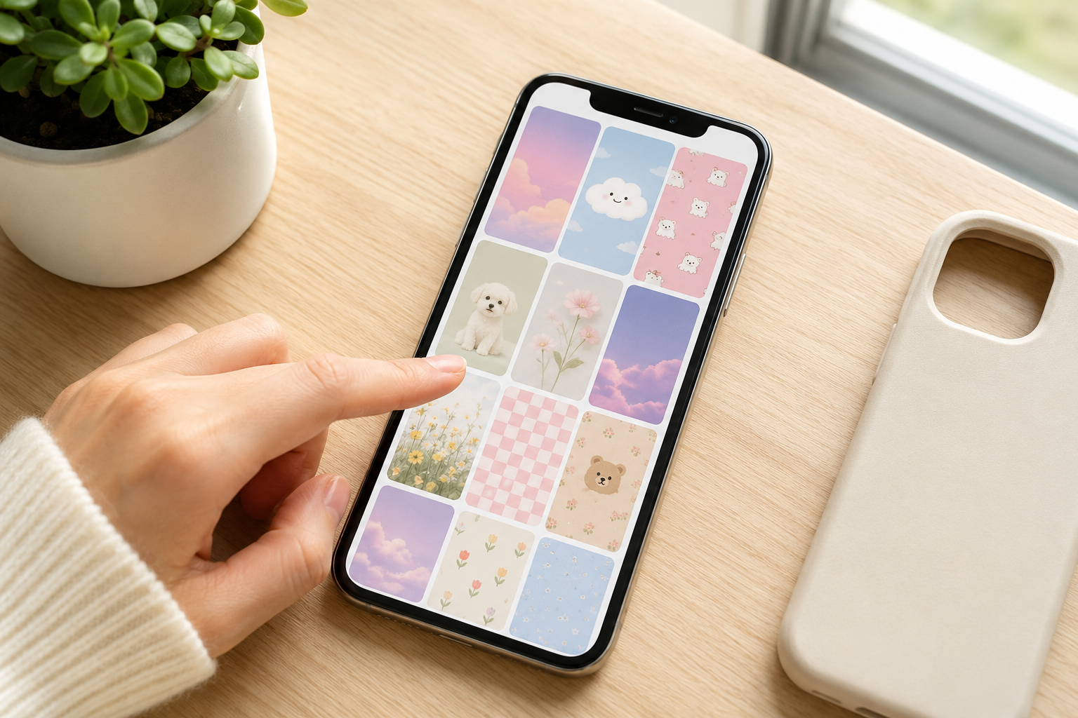
How to Coordinate Your Lock Screen and Home Screen
A matched pair makes an iPhone look more polished than using two unrelated wallpapers. The designs do not need to be identical. They simply need to share a clear visual connection.
- Choose one main wallpaper: Start with the more detailed image you want to feature on the lock screen.
- Pull one background color: Use a solid or softly textured version of that color for the home screen.
- Repeat one small motif: Carry over a bow, flower, heart, star, or fruit illustration in a simpler form.
- Match widgets carefully: Use widget colors that blend with the wallpaper rather than introducing a completely new palette.
- Check both screens in use: View the setup with notifications and app icons visible before deciding it is finished.
For example, a strawberry lock screen can pair with a pale pink home screen, while a dreamy sunset lock screen can pair with a blurred peach-and-lavender gradient.
Tips for Keeping a Cute Home Screen Easy to Use
A cute wallpaper should support your phone layout, not make it harder to find apps. If your background is decorative, keep the rest of the screen relatively simple.
- Use fewer large widgets instead of several small competing elements.
- Group apps into folders when a busy background makes individual icons harder to scan.
- Choose a wallpaper with lower contrast behind the main rows of apps.
- Keep important visual details away from the dock and widget areas.
- Save a clean version of the wallpaper before adding any optional text or decorative elements.
It can also help to preview the wallpaper at different brightness levels. Very pale backgrounds may become difficult to read outdoors, while dark designs can make some icons disappear. A medium-light background with clear contrast is often the most practical choice.
How Often Should You Change Your Phone Wallpaper?
There is no correct schedule. Keep one signature design for months or rotate wallpapers weekly or seasonally. Save coordinated pairs in folders such as pastel, floral, cozy, minimal, and playful so you can refresh the screen without rebuilding the entire layout.
Final Thoughts on Cute Wallpaper Ideas for iPhone
The best cute wallpaper is one that looks attractive, feels personal, and still lets you use your phone comfortably. Pastel gradients, tiny florals, bows, fruit prints, celestial patterns, cozy scenes, and personalized collages can all create a fresh aesthetic when the composition is designed around the clock, widgets, and app icons.
Start with one style that matches your current mood, then build a coordinated lock screen and home screen pair around it. Even a simple change in color, pattern, or texture can make your iPhone feel new again and give your everyday screen a more intentional look.