30 Fine-Line Script Tattoo Ideas That Feel Personal, Not Predictable
Fine-line script tattoos can be some of the most personal tattoos you choose. A few carefully placed words can hold a memory, private joke, reminder, name, date, lyric fragment, or piece of handwriting that means far more to you than it does to anyone else.
The challenge is finding fine-line script tattoo ideas that do not immediately feel like something you have seen hundreds of times. Popular phrases, overly decorative cursive, and extremely tiny lettering can make a tattoo feel less distinctive. They can also create practical problems when delicate letters are squeezed into too little space.
A more thoughtful approach starts with the words themselves. Instead of choosing a trendy phrase first and finding a font later, consider what you genuinely want the tattoo to communicate. Then think about handwriting style, letter spacing, placement, scale, and how the design will sit with the natural lines of your body.
The 30 ideas below range from minimal lowercase words to handwriting-based designs and subtly unconventional placements. Use them as starting points rather than scripts you have to copy exactly. The best result will usually come from adapting the concept to your own words and working with a tattoo artist who understands delicate lettering.
What Makes a Fine-Line Script Tattoo Look Less Cliché?
A script tattoo does not become original simply because it uses a beautiful cursive font. What makes the design feel personal is usually the combination of word choice, lettering style, spacing, scale, and placement.
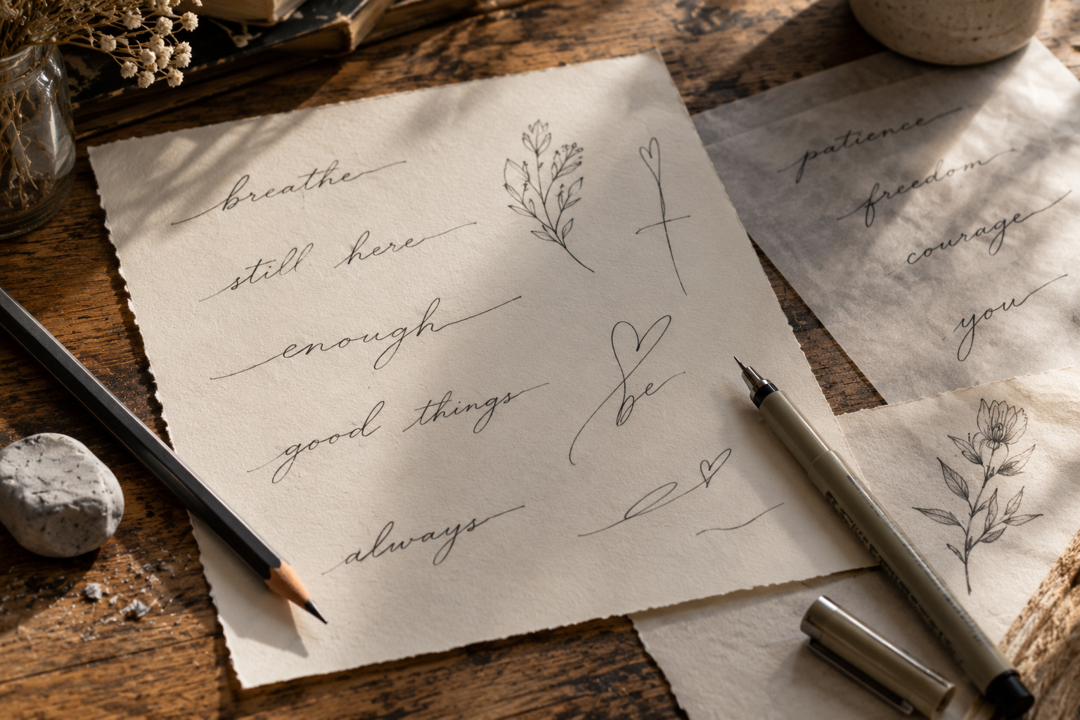
One effective approach is to avoid starting with a font at all. Write the phrase yourself. Ask someone important to you to write it. Look at old cards, notes, recipes, letters, or journal pages for handwriting that has genuine meaning. Natural handwriting contains tiny inconsistencies that computer-generated lettering often lacks.
You can also make familiar language feel more individual by reducing it to the most meaningful part. Instead of tattooing a complete quotation, one unusual word or a short two-word fragment may carry the same meaning with less visual clutter.
Fine-line lettering also benefits from restraint. Flourishes can be beautiful, but every loop, stroke, and decorative tail creates another element that has to remain readable as the tattoo settles into the skin. Simple lettering with deliberate spacing often looks more refined.
How to Choose Script Tattoo Fonts That Age Gracefully
The prettiest lettering on a screen is not automatically the best lettering for skin. Tattoos live on a moving, changing surface rather than a perfectly flat sheet of paper.
Extremely narrow spaces inside letters can become harder to distinguish as a tattoo ages. Very small loops, tightly packed words, and multiple overlapping strokes can also reduce readability. This matters particularly with elaborate cursive tattoo design.
Before committing to a design, consider these practical points:
- Prioritize spacing. Give individual letters enough room to remain visually distinct.
- Avoid unnecessary flourishes. Decorative swashes should contribute to the composition instead of surrounding every word.
- Test several sizes. A slightly larger version may still look delicate while providing substantially more breathing room.
- Consider the placement. The same lettering can look completely different on a straight forearm, curved rib area, collarbone, or ankle.
- Ask for a stencil preview. Looking at the design at actual tattoo size is much more useful than judging an enlarged digital version.
An experienced fine-line or lettering artist can explain what level of detail is realistic for the size and placement you want.
30 Fine-Line Script Tattoo Ideas to Save
1. A Single Lowercase Word
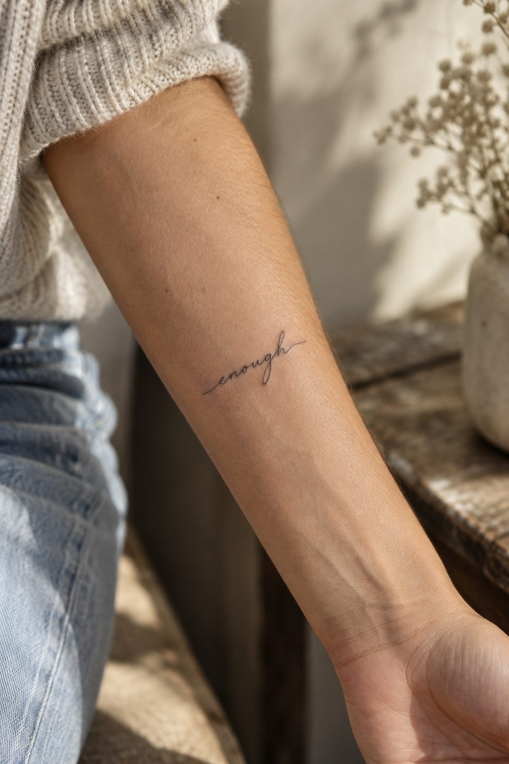
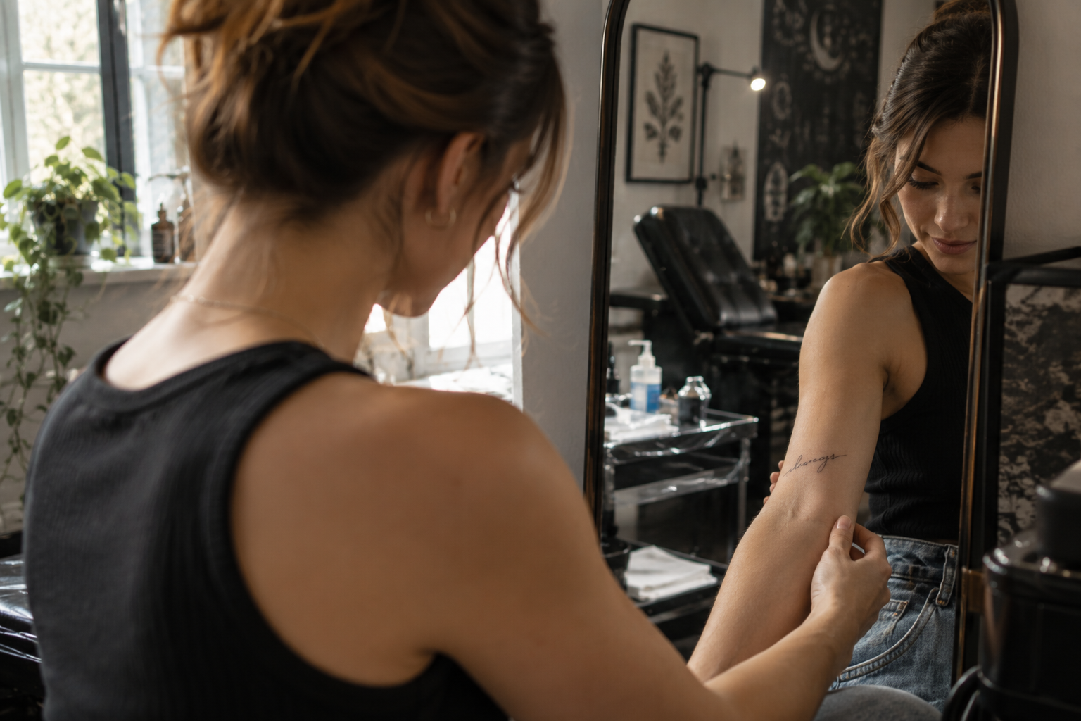
Choose one word that has a specific personal association and set it in understated lowercase handwriting. Keeping the lettering simple shifts attention away from decorative typography and toward the meaning. The inner forearm, upper arm, or ankle can work well for this minimalist approach.
2. Your Own Handwriting
Write the word or phrase naturally several times rather than trying to make your handwriting perfect. One of those spontaneous versions may have exactly the character you want. A tattoo artist can clean up distracting marks while preserving the recognizable rhythm of your writing.
3. Handwriting From a Loved One
A word taken from an old note, card, recipe, or letter can make a small tattoo highly individual. Instead of recreating an entire sentence, isolate a short piece that still carries the person’s handwriting and personality.
4. A Two-Word Private Reminder
Short combinations such as a verb and noun can feel more personal than familiar motivational quotations. Think about language you actually use when encouraging yourself. Two words also leave enough room for generous spacing without requiring a large tattoo.
5. A Tiny Initial in Natural Handwriting
Rather than choosing a formal monogram, use an initial written naturally by you or someone meaningful. A small handwritten letter near the wrist, arm, rib, or ankle can feel intimate without immediately revealing its significance.
6. An Unfinished-Looking Phrase
A fragment can be more intriguing than a complete statement. Select a few words that make sense to you even when they appear incomplete to everyone else. This works particularly well with relaxed handwritten lettering rather than ornate calligraphy.
7. A Word Following the Collarbone
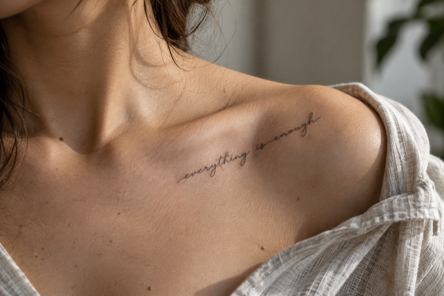
The collarbone provides a natural directional line for script. A delicate word can follow that structure rather than sitting horizontally regardless of anatomy. Keep the lettering clean enough that the design does not compete with the subtle placement.
8. Vertical Script on the Inner Arm
Script does not always need to travel horizontally. A short word positioned vertically along the inner arm gives familiar lettering a more graphic composition. Test both reading directions with your artist before deciding which orientation feels most natural.
9. A Fine-Line Rib Phrase
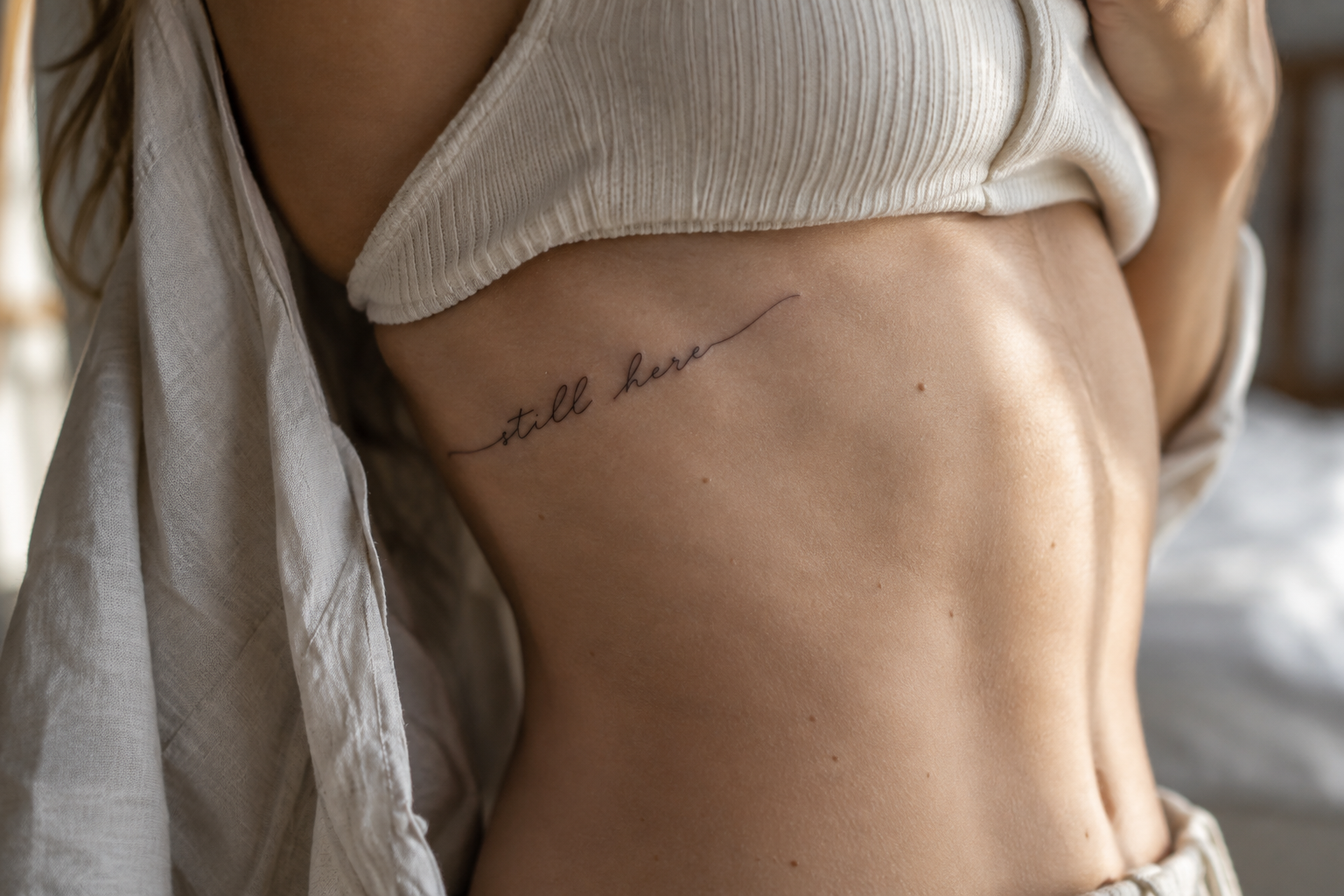
The ribs can accommodate a longer line without making it dominate your everyday appearance. A phrase that gently follows the body’s contour often feels more intentional than a perfectly rigid baseline. This placement deserves careful stencil positioning because posture changes the way the words appear.
10. A Small Word Behind the Upper Arm
The back of the upper arm offers a discreet location for a minimal script tattoo. It is especially suited to one or two words in clean handwriting. The less obvious placement can make even a simple phrase feel more personal.
11. A Meaningful Date Written as Words
Instead of conventional numerals, consider writing part of a significant date as a word. The result can read more like a fragment of handwriting than a traditional date tattoo, particularly when paired with restrained lowercase lettering.
12. Coordinates Reimagined as Handwriting
If a location matters to you, coordinates do not have to look technical. A handwritten interpretation with thoughtful spacing can soften the numerical format. Keep the numbers clear enough that decorative strokes do not make individual digits ambiguous.
13. One Word in a Parent’s Handwriting
A simple word copied from a parent’s handwritten note can carry more individuality than a generic memorial phrase. Preserve characteristic letter shapes instead of turning the sample into polished calligraphy.
14. A Childhood Nickname
A nickname connected to family or childhood can become an understated piece of personal history. It is particularly effective when recreated in the handwriting of the person who used that name for you.
15. A Word With One Deliberate Imperfection
Perfect digital lettering can sometimes feel impersonal. A slightly uneven baseline, unusual letter connection, or distinctive handwritten stroke can give a fine-line tattoo character. The goal is intentional naturalism rather than messy execution.
16. Minimal Typewriter-Inspired Script
Not every lettering tattoo needs cursive. A fine, restrained typewriter-inspired word can provide a clean alternative for anyone who likes script tattoos but dislikes flowing calligraphy. Give the characters enough spacing to maintain their clarity.
17. A Tiny Signature Detail
A recognizable part of a signature can become a subtle tattoo without reproducing the entire name. An initial, distinctive letter, or short handwritten ending may preserve the emotional connection while keeping the design visually light.
18. A Phrase With No Capital Letters
Removing formal capitalization can make a short phrase feel quieter and more contemporary. This works especially well with simple handwriting tattoo ideas where the letterforms remain open and uncluttered.
19. One Word Along the Ankle
A fine-line word following the ankle can create a delicate horizontal detail without requiring elaborate decoration. Short words generally suit the limited area best. Discuss scale carefully so the tattoo does not become unnecessarily tiny.
20. A Phrase Broken Into Two Lines
If your chosen wording is slightly too long for one elegant line, consider dividing it intentionally. Two short lines can create a compact composition with better spacing than shrinking the entire phrase. The line break itself can also emphasize meaning.
21. Script With a Tiny Botanical Accent
A restrained botanical mark can complement lettering without turning it into a large illustrated piece. Think of a tiny stem, leaf, seed, or single petal positioned as punctuation rather than a full floral arrangement.
22. A Handwritten Word With a Fine Underline
A single understated line beneath part of a word can give the composition structure. Instead of a dramatic flourish, keep the underline slightly imperfect so it feels connected to the handwriting.
23. A Word Curved Around the Wrist
Rather than placing script straight across the wrist, let a short word subtly follow its curve. Avoid compressing a long sentence into a bracelet-sized design. Generous spacing is more important than fitting additional words.
24. A Quiet Reminder Near the Elbow
The area above or beside the elbow can make a tiny script tattoo feel less predictable than standard wrist placement. A short personal reminder works well here because the unusual position becomes part of the composition.
25. A Short Phrase in Mixed Handwriting Styles
Two genuinely meaningful handwriting samples can sometimes be combined into one piece. For example, one word might come from your handwriting and another from someone else’s. Keep the composition simple so the contrast looks intentional.
26. A Word With Extra Letter Spacing
Airy spacing can transform straightforward lettering into a more editorial-looking design. This technique works particularly well with simple printed handwriting or minimally connected script. It also prevents the design from feeling visually crowded.
27. A Tiny Phrase Above the Knee
A small line of handwriting just above the knee creates a subtle placement that can be shown or covered easily. Because the area moves, stencil placement should be checked while your leg is in more than one natural position.
28. A Word Taken From a Journal Entry
Old journals can contain language that feels far more authentic than searching lists of tattoo quotes. Look for a word or short fragment that captures a specific period of your life, then consider using the original handwriting as part of the design.
29. A Phrase Only You Fully Understand
A tattoo does not need to explain itself to strangers. An ordinary-looking fragment can carry a private reference to a place, conversation, relationship, achievement, or turning point. That hidden context is often what makes simple script feel genuinely individual.
30. A Custom Phrase Designed Around Your Placement
Instead of selecting finished lettering and then searching for somewhere to put it, reverse the process. Choose the placement first and have the artist build the script around its available length, curvature, and viewing angle. This creates a tattoo that belongs to that part of the body rather than looking like text pasted onto it.
Best Placements for Fine-Line Script Tattoos
Placement affects much more than visibility. It determines how long the phrase can comfortably be, how much curvature is involved, how the tattoo looks while your body moves, and how easily another person can read it.
The inner forearm is one of the most versatile choices because it provides a relatively long area for one or several words. It also makes checking the tattoo yourself easy.
The collarbone suits short, delicate lettering that follows the body’s natural line. Because this area already has a strong visual direction, simple script is often enough.
The ribs provide more room for longer phrases and allow a script tattoo to remain relatively private. Curved placement can look beautiful here, but the stencil should be evaluated with normal posture rather than only while the body is stretched.
The upper arm and back of the arm work well for discreet words and short phrases. The ankle can suit shorter designs, while areas around the wrist are better approached with enough scale and spacing to keep the lettering clear.
Do not choose placement only because a photograph looks attractive. Bring your desired wording to your tattoo artist and compare several realistic stencil sizes on your own body.
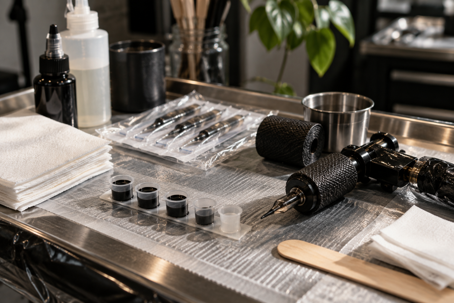
How to Make a Handwriting Tattoo Feel More Personal
If you want the result to look unlike generic downloadable lettering, start with material that already belongs to your life.
- Collect handwriting samples. Look through notes, letters, cards, journals, recipes, or other meaningful paper items.
- Choose the words before polishing them. Meaning should come before typography.
- Identify distinctive letters. Notice unusual loops, spacing, capital letters, or imperfect strokes worth preserving.
- Remove unnecessary detail. Smudges and accidental marks do not always need to become part of the tattoo.
- Test the design at actual size. A handwriting sample that looks clear when enlarged may need adjustment when reduced.
Custom does not mean complicated. One authentic handwritten word can have more personality than an elaborate phrase assembled from a fashionable font.
The Script Tattoo Mistake That Can Hurt Legibility
One of the easiest mistakes to make with fine-line lettering is assuming that smaller automatically means more delicate.
Scale and delicacy are not the same thing. A tattoo can remain refined while still giving each letter enough room to breathe. If the loops of several cursive letters are packed together, or if a long phrase is reduced until the spaces almost disappear, the design may lose the clean quality that attracted you to it in the first place.
This is why screenshots of digital fonts should be treated as inspiration rather than final tattoo-ready artwork. Your artist may recommend widening spaces, simplifying a loop, adjusting a connection, or increasing the overall dimensions.
Those changes do not ruin a minimalist concept. They help translate it from typography on a screen into lettering designed specifically for skin.
What to Bring to Your Script Tattoo Appointment
You do not need a perfectly finished design before meeting your tattoo artist. In many cases, references are more useful than trying to dictate every line in advance.
Consider bringing:
- The exact spelling and punctuation of your chosen wording
- Original handwriting samples if they are part of the concept
- Two or three examples of lettering styles you like
- Examples of script styles you specifically dislike
- Placement references showing the general direction or flow you prefer
- An openness to adjusting scale for readability
If the tattoo contains a word in a language you do not use fluently, verify the spelling and meaning independently before the appointment. Your tattoo artist is responsible for tattooing the approved design accurately, but the wording itself should be something you have carefully confirmed.
How to Choose Your First Fine-Line Script Tattoo
If this will be your first lettering tattoo, reduce the decision to three questions: What do I want it to say? How do I want those words to feel? Where should they naturally sit?
Start with the message. Write down several options and leave them alone for a few days. If one still feels meaningful without needing an explanation, it is a stronger candidate.
Next, compare lettering styles. You might prefer imperfect personal handwriting, restrained cursive, simple lowercase print, or lightly spaced typewriter-inspired lettering. Do not select a complicated font merely because it looks impressive when enlarged.
Finally, test the placement. Print or draw the phrase at several sizes and compare the proportions against the body area you are considering. Your tattoo artist can then refine the dimensions and stencil before anything becomes permanent.
Final Thoughts on Fine-Line Script Tattoo Ideas
The strongest fine-line script tattoo ideas are rarely the ones with the most elaborate font or longest quotation. They are the designs where the wording, lettering, scale, and placement work together.
If avoiding cliché is your priority, look beyond lists of popular tattoo sayings. Your own handwriting, a loved one’s note, an unusual fragment from a journal, a private nickname, or two words connected to a specific memory can provide much richer starting material.
Give the lettering enough space, resist making every detail microscopic, and let your tattoo artist adapt the design to your anatomy. Fine-line script can still feel subtle without sacrificing clarity.
Most importantly, choose words that continue to matter even when nobody else understands the reference. A small script tattoo does not need to announce its meaning. Sometimes the most distinctive design is simply the one that could only belong to you.